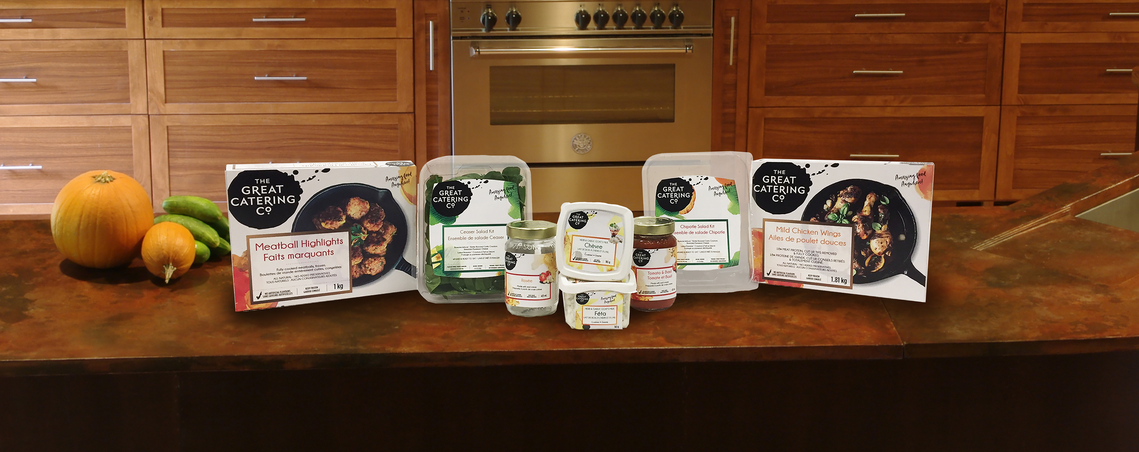
The Great Catering Co. is now expanding into the packaged food market. They are starting off with a line of salad kits, meat highlights, cheeses and sauces. Because they have never done advertising in this way I came up with a system that has a variety of flex and is strong in their own category. The logo is done in a black vector splatter to create an icon that is stands out and is very recognizable. Then to play with the watercolour splatters that the company usually uses, they are used of the packages to create a flavour appeal and to give a sense of what is in each package. Each category has a coloured box that helps shoppers recognize the line that package belongs is and each kind in that line is a different colour. Sauces, dinner highlights and cheeses use photography to give a sense of what the catering company uses that product for and it add more to flavour appeal. The company’s slogan is also on every package to explain why they have moved to packaged food.


